 |
|
|
|
#1
|
||||
|
||||
|
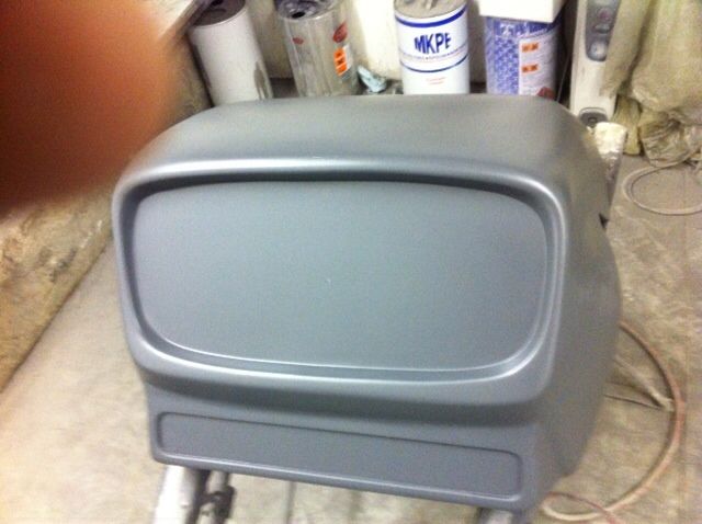
Got some sneak peak of the buck for the new equinox Nosecone
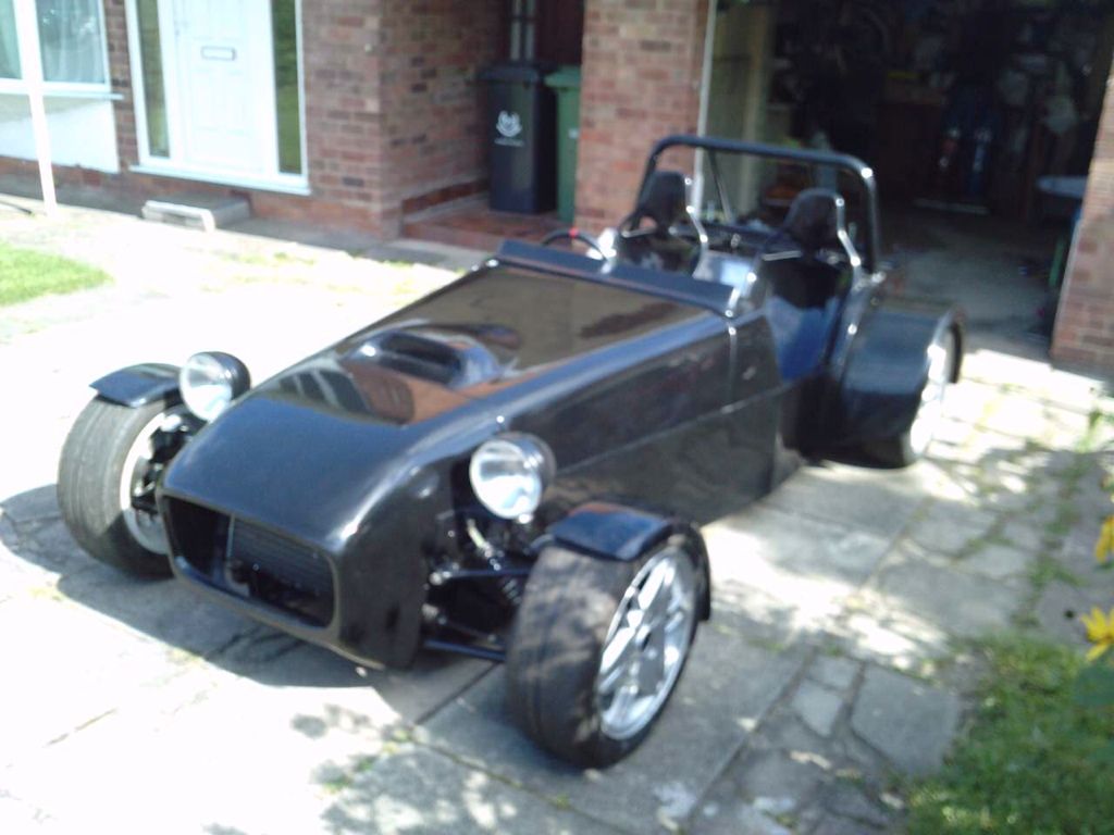
You asked and Dave has created it. Took these today :   UPDATED PICTURE see others later in thread  Plus a picture of the bodywork fitted to a customers car (old nose cone)  Dave hopes that people will like the new nose and welcomes feedback. Last edited by Ben_Copeland : 18th September 2012 at 09:48 PM. |
|
#2
|
|||
|
|||
|
You have to be impressed with the way dave responded to that nosecone request. When you think we have been waiting years to see the vindaloo body products. Anyway you asked for a critical eye to be cast over it and here it is,in my opinion which is humble and worthless
 i think the whole thing is brilliant till it gets down to the oil cooler aperture. I think it needs more of a radius on the two bottom corners and slightly reducing the width of the cooler hole and again more of a radius in the aperture to stop it looking letter box like. i think the whole thing is brilliant till it gets down to the oil cooler aperture. I think it needs more of a radius on the two bottom corners and slightly reducing the width of the cooler hole and again more of a radius in the aperture to stop it looking letter box like.Bob
__________________
When The Results Disagree With The Theory: Believe The Results And Invent A New Theory If I had two brains I,d still be a halfwit The cave http://s1116.photobucket.com/user/my...deshow/mancave The build http://www.haynes.co.uk/forums/showthread.php?t=12669 Last edited by robo : 17th September 2012 at 10:44 PM. |
|
#3
|
|||
|
|||
|
I think it looks good -a vast improvement.
However I think the opportunity may have been missed to design something a bit different eg flowing the two shapes into each other  |
|
#4
|
||||
|
||||
|
Ok so if it flowed into eachother and the radius at the bottom corners changed it would be spot on
|
|
#5
|
|||
|
|||
|
It looks nice but it would be better if the sides were wider and covering more the wishbones when you look at it at the front.
|
|
#6
|
||||
|
||||
|
It's not a very good picture tbh. They do cover the wishbone mounts well. The picture makes it look narrower than it is.
|
|
#7
|
|||
|
|||
|
yep
 Carefull how you tell him cos you might end up wearing it for a hat. Carefull how you tell him cos you might end up wearing it for a hat.Bob
__________________
When The Results Disagree With The Theory: Believe The Results And Invent A New Theory If I had two brains I,d still be a halfwit The cave http://s1116.photobucket.com/user/my...deshow/mancave The build http://www.haynes.co.uk/forums/showthread.php?t=12669 Last edited by robo : 17th September 2012 at 08:59 PM. |
|
#8
|
||||
|
||||
|
I think helpful criticism is likely to result in a product that everyone wants.
|
|
#9
|
||||
|
||||
|
Quote:
 |
|
#10
|
|||
|
|||
|
think its nice
the lower section could do with a more organic rounded shape in my opinion |
 |
| Thread Tools | |
| Display Modes | |
|
|